

The short answer is yes and no. Yes, the NRL is more competitive now than when it started but no, it doesn’t seem to be a thing that improves consistently year-on-year.
Let me explain. On this blog, we use Elo ratings to measure teams’ performances and assess each team’s probability of winning a game in advance. Surely we can use our ratings system to assess the competitiveness of each NRL season.
Philosophically, what is a high level of competitiveness? It has to be a situation where the teams are fairly close in performance resulting in a hard to predict outcome. Here’s two ways of measuring that closeness of performance with pros and cons.
- You could look at the spread of teams ratings. Pro – makes an assessment based on all teams. Con – if all teams are pretty average but one team is excellent and another awful, then there isn’t a big spread of talent. This would imply a highly competitive season even though there is really only one potential premiership contender.
- You could look at the difference between top and bottom ratings. Pro – simple. Con – if one team is truly terrible and three or four are pretty good, then the season is pretty competitive but the difference between top and bottom might be exaggerated due to the crapiness of the bottom team. This would imply a not particularly competitive season despite there being multiple potential champions.
Which is better, measuring the spread or measuring the difference from top to bottom? Neither way of doing this is immediately obvious as a better method. Let’s look in more detail.
Measure spread by standard deviation
The standard deviation is the variation in a dataset that follows a normal distribution. A low standard deviation means that most of the data falls close to the average (or mean) and a large standard deviation means it’s all over the shop. Basically, if you have a bell curve, the standard deviation tells you flat (high standard deviation) or tall (low standard deviation) the curve is around the average. This is a good measure of the spread of teams.
The range of Euclid ratings is close to a normal distribution (bell curve).
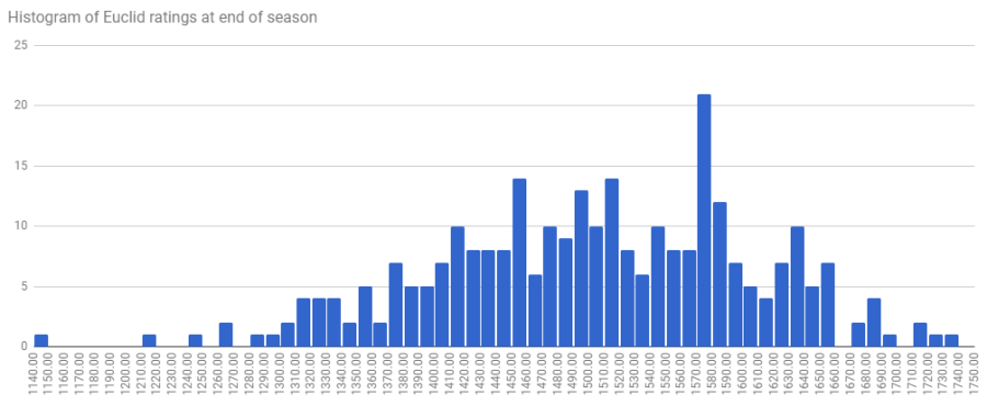
Well, close enough.
68% of values fall within one standard deviation of the average in this kind of distribution. A more competitive season will have a lower standard deviation – and so more teams closer to the average – than a less competitive season, which will have a higher standard deviation. The standard deviation over the period 1998 to 2016 is 103 rating points which means that around two-thirds of teams will finish in the range of roughly 1400 to 1600 points, as 1500 is always the average rating in our Elo systems.
Compare top to bottom by ratings gap
For our purposes, the ratings gap is the difference between the end of season rating of the top team and the bottom team. Today, I’m using Euclid’s numbers but I’ve tried it with Archimedes and get a pretty similar result.
Here’s every team’s end of season rating since 1998:
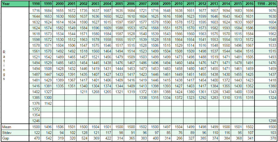
From 1998 to 2016, the average between the top and bottom rated teams has been 378 rating points. The average top rated team finishes the season on 1676 and the average bottom rated team finishes on 1298.
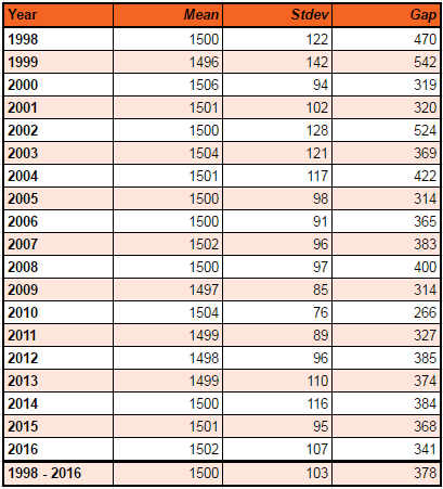
Which one to use? Here’s what the numbers look like side-by-side:
Both methods of measuring competitiveness are pretty well correlated: the lower the standard deviation, the lower the ratings gap and the more competitive the season was.
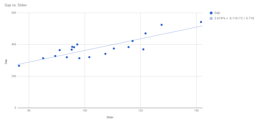
They’re basically equivalent, which is a little surprising. It implies that each season tends to distribute between top and bottom in a fairly similar way. Given their equivalence, I’m going to continue my analysis using ratings gap*, which is a bit more intuitive.
Competitiveness
As I said in the intro, competitiveness doesn’t improve year-on-year. There’s not much of a correlation between the passage of time and the ratings gap:
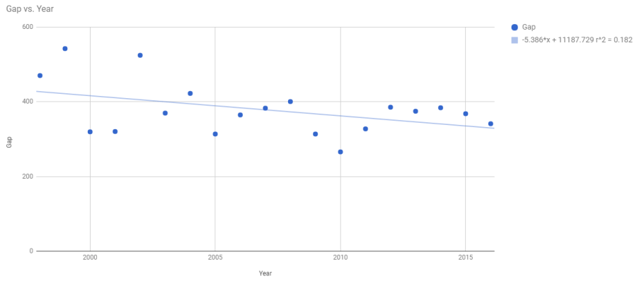
Competitiveness improves in step changes. We can see that here:

Depending on what point you want to use to demarcate different eras of NRL, you can see that the average ratings gap for the earlier years of the competition is higher, and therefore less competitive, than the more recent years. There’s not much difference between the 2000s and 2010s (only 2%) but there’s a big difference between in the period between the Bunnies rejoining in 2002, the Titans joining in 2007 and now (around 12%). There’s an 18% difference before and after golden point was introduced.
Any analysis like this is going to require a bit of cherry picking but the improvement in competitiveness is definitely real, even if the cause is a little murky. Next time, we’ll look at what some of the implications might be of improving competitiveness.
*To be fair, this relationship is not obvious/trivial and still needed to be proven so thanks for sticking with me through the standard deviation stuff.
