

Turns out that StatScore didn’t pan out the way I had hoped. There were some conceptual errors but the biggest was that I wanted a measure of rate and a measure of volume and you can’t have one statistic that does both. It’s like having one number that meaningfully states that a boxer is both the best in the world pound-for-pound but also the best boxer in the world who can beat anyone irrespective of weight classes. The world doesn’t work like that. As a result, there was some okay, but not great, player analysis. Unfortunately, the creation of a new tool requires that you use it for a while on new scenarios in order to evaluate it’s usefulness. Sometimes it doesn’t pan out as well as you would have hoped.
Also, the name sucked.
So I went back to the drawing board. There were some salvageable concepts from StatScore that have been repackaged, with corrections made for some fundamental mistakes, and repurposed into new player rating systems: PPG and WARG.
The basics
Again, if you don’t have the will or the time to read this godforsakenly enormous post, here are the salient bits. Feel free to click the links to skip ahead.
PPG stands for Production Per Game and is a measure of the rate at which valuable work is done over time played, as compared to the average player in that position.
WARG stands for Wins Above Reserve Grade and is a measure of the volume of valuable work done, as compared to the reserve grade player in that position.
“Valuable work” in this context is the accumulation of statistics produced in categories that correlate with either wins or points. This is also generically referred to as “production“.
COP stands for Consistency of Production and is a measure of the spread of the production created each game by a player compared to the spread of production created on average in that position. A positive number means the player is more consistent than average for that position and negative number implies greater inconsistency.
xPPG stands for eXpected Production Per Game and is a projection of the PPG a player is capable of based on their previous performances. TTP stands for Team Theoretical Production and is a projection of the total production we expect a team to be capable of based on the component xPPG of its lineup. These are used for tipping.
There’s also a lengthy epistemological discussion at the end.
Production Per Game (PPG)
The first step was to get all the player stats for each match across all the categories that the NRL website records for 2013 through 2018 of the NRL and 2016 to 2018 of the Queensland Cup. We need not discuss how long this took or how labour intensive and mind-numbingly boring it was and, yes, we also need not discuss that I probably could’ve cobbled together a scraper in less time.
Doing the regression
A regression is a mathematical tool that determines how correlated two variables are. For PPG, we want to know how well correlated winning percentage is with any number of individual statistics, like running metres or tries scored, and base our player rating system on that. This is given by a number between zero and one, where zero is no correlation and one is exactly correlated, called R-squared.
We also want to know what kind of relationship the two variables are and this is described by the slope between them. A positive slope means that if you increase one variable (running metres), the other variable also increases (win percentage). A negative slope means that as one variable increases (errors), the other variable decreases (win percentage). The magnitude of the slope tells us the rate at which the variables change, e.g. the slope between tries and win percentage is steeper than between running metres and win percentage, meaning that scoring one try increases your output win percentage more than adding one running metre.
In the past, the regression that underpinned StatScore was done with end of season stats against number of wins at a team level. This has a number of problems of which I was not then but am now aware. Specifically, there’s a false level of correlation generated by some teams having played more games and having the opportunity to produce more stats. I realised this was an issue very quickly when I ran the regressions over regular season stats only and found that correlations that I was very confident existed simply evaporated into thin air.
Furthermore, the resolution for judging each team’s performance is very limited if we only measure it in wins. We are really only limited to 24 or 28 potential, discrete outputs, whereas points difference (for example) can have a greater range of variation and offers a more precise picture of how a team performed during the season. So, for example, correlations that should exist, say between possession rates and winning, don’t exist if we use the StatScore method. This led to me bucketising the stats.
With the individual match data, I could take a very different approach to regression than I had with StatScore. Bucketisation in this case requires sorting statistics into categories based on the magtiude of that statistic. So, for example, we take all the games with zero line breaks and put them in the first bucket, games with one into the second and so on, until all the games are categorised into buckets.
For PPG, I compared the bucket stat against the winning percentage of the teams that were in that bucket. For example, I found that teams that scored zero tries won 2.8% of their games, teams that scored one try won 10.6% of their games, two tries at 16.6% and so on up to any team that scored seven or more tries won 100% of their games. Once all the stats were bucketised, I calculated their correlation coefficient (R-squared) and their slope against win percentage.

It’s possible that instead of using a linear trendline, we could use something like a polynomial or a logarithm to get a better fit but that complicates the maths and we don’t know if that adds any real information or the data we have has its particular shape due to a small sample size.
After that, I eliminated any stats
- that looked possession-based and otherwise pointless (passes, receipts, play the balls),
- were rate-based (conversion rates, tackle efficiency, average play the ball speed),
- are extremely rare (one-on-one steals, field goals, 40/20 kicks),
- that counted something that another stat could measure better (kick metres in lieu of kicks, running metres in lieu of runs),
- with a counter-intuitive slope (the more cross field kicks you make, the more likely you are to lose so cross field kicks are bad?),
- and anything with an R-squared below 0.25.
Taking a closer look, some of the regressions were thrown off by freak results at the extremities. The most number of forced drop outs in a Queensland Cup game (2016 – 2018) is six. That happened three times, netting two losses and a draw. The R-squared then is 0.03. Take those three results out and the R-squared rises to 0.75. The principle is handily demonstrated in this chart. The red line shows the trend if we ignore the three 6 FDO games and the blue line shows the “trend” if we include them.
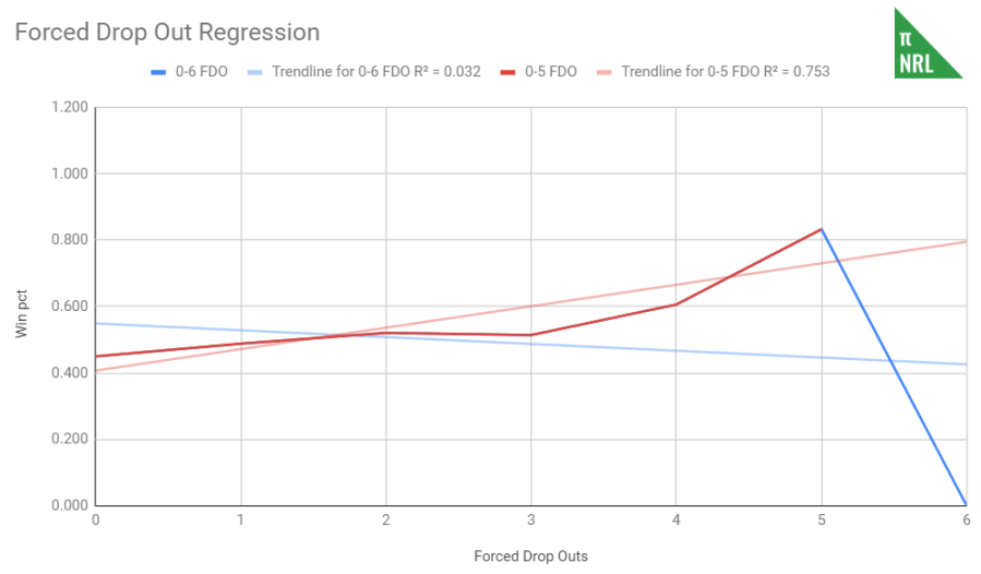
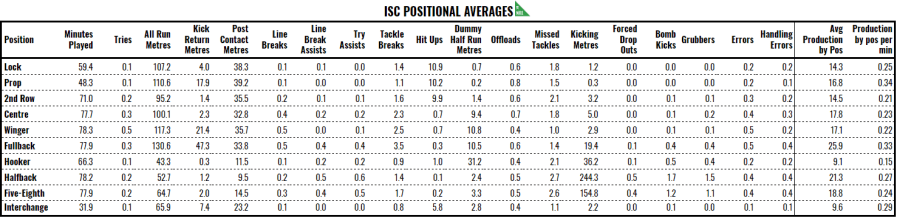
There’s clearly a relationship, albeit one with a shallow slope, but due to weird things buried in small sample sizes, the regression is thrown off. The reverse can be true as well. One game where there is an exceptionally high number of dummy half metres made, for example, that is won makes the trend look stronger than it is. Sometimes, a little human intervention is required but we don’t want to do it too much or we’ll overfit the data and things will be too idealistic. It helps to compare between the NRL and the ISC datasets to see where things might be off.
Production
Now that we have the stats that appear to correlate well with winning, we can determine production. Production is the accumulation of statistics that represent valuable work. Valuable meaning “increases win percentage”. There can also be the negative production, which is the accumulation of statistics that decrease win percentage.
This left us with the following chart of R-square values and weighting coefficients to help calculate production. R-squared numbers in blue have been altered per the above.
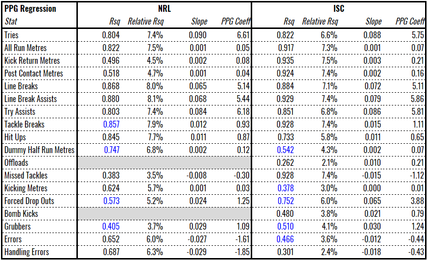
The relative R-squared was used in StatScore. This is the portion that the stat contributes to the sum of all R-squareds. It is ultimately meaningless, and in no sense is this a widely accepted statistical technique or even a technique, but the purpose is to more heavily bias the concept of “production” towards stats that have higher levels of correlation.
The weighting coefficient is the product of the relative R-squared and the slope by 1000. You can think of this as the amount of production created when one of the stats occurs. For example, 6.6 production is created when a try is scored in the NRL but only 0.05 production is created for a running metre. This means that 132m run is equivalent to a try in production terms. In the Queensland Cup, gaining 82m of running metres is equivalent to a try.
You might think that this concept of production biases itself towards certain kinds of players. You would be correct. Hookers produce less than halfbacks and fullbacks, probably because the biggest contribution hookers made is in tackling and we don’t include that due to it’s counter-intuitive slope. So when we say “hookers and centres produce less than fullbacks and halfbacks”, we’re not saying that they’re less useful, just that we don’t record their output as well across positions.
Final adjustments
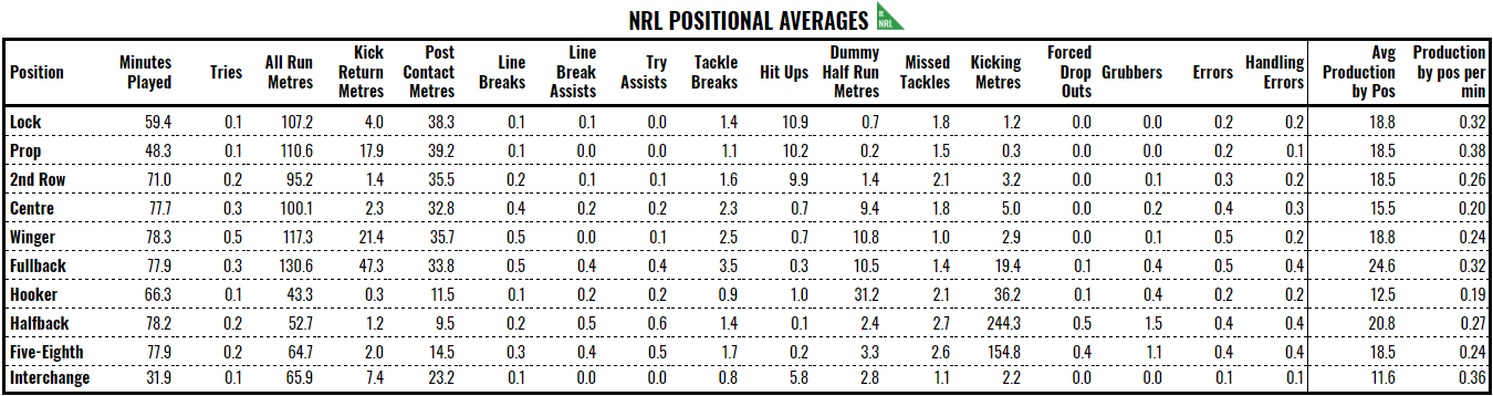
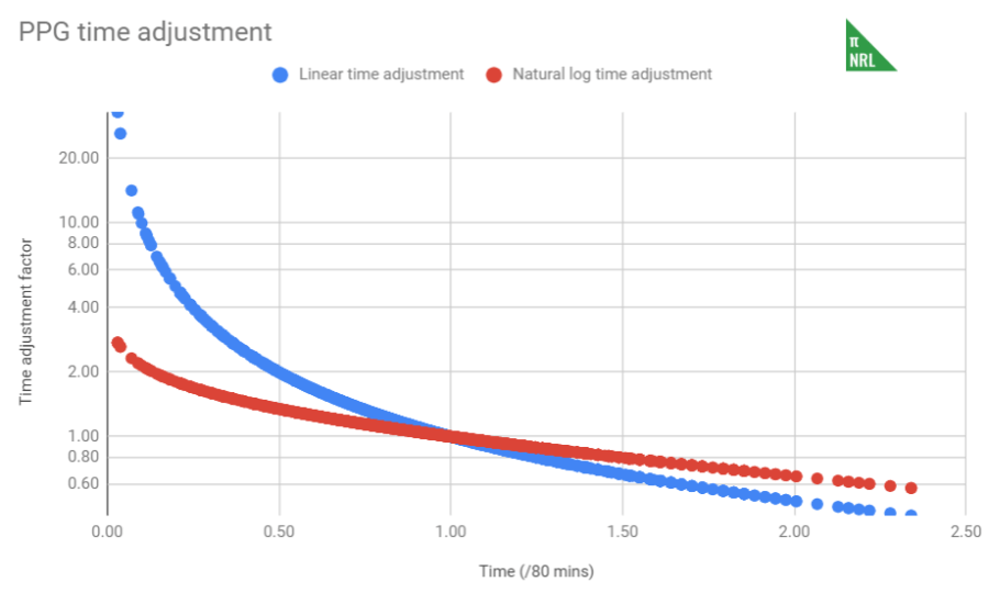
With these fundamentals in place, things start to get easier. Each game, we multiply the relevant stats by the relevant weighting for each player to calculate raw production. We then adjust it for the time played. Looking above, the average time on field, even for eighty minute positions in the back line, is less than 80 minutes. That means, if the stat averages are based on a mean of 77 minutes on the field and you played 80, you had 3.9% extra time on the field and that should be reflected by tweaking your production, as compared to the average player in your position, downwards.
The formula is not a straight percentage increase (e.g. you play 10% less than average, so your production is adjusted upwards 10%) because, as you see with the blue series below, for very short intervals, this adjustment becomes rather large. Similarly, it overly punishes interchange players who put in big stints. Instead, the adjustment uses the red series, which is 1 – 0.5*ln(time on field / avg time). There’s no science to this formula other than it looks about right.
 Finally, we divide the time-adjusted production by the average production for the position and divide by 10 (just for aesthetic purposes; we multiplied by 100 in StatScore) to get the PPG for each player. A player’s PPG over a longer term is the average of their individual match PPGs. We will usually look at it over the season (sPPG) or the player’s career, weighted by games played each season (wcPPG).
Typically, a minimum of five games is required to have a reasonable basis for stating a player’s PPG. By definition, the average PPG is .100 but if we exclude players with fewer than five games a season, the average league sPPG is around .095 in the NRL and .120 in the Queensland Cup. A player that is twice as productive as average would be .190 in the NRL or .240 in the QCup.
Consistency of Production (COP)
COP is a sidenote, really, but it might be interesting to track and could be of use if you’re one of those Supercoach types.
An average, like PPG, can only tell you so much. The numbers 4, 4 and 7 have the same average as 0, 5 and 10 but the former has considerably less variation, and so more consistency, than the latter.
I have made the somewhat heroic assumption that each player’s production is normally distributed. On that basis, we can use the standard deviation of player production to determine the variation in a set.
In this case, we want to compare the variation of a player’s performances to what is typical for a player in his position. So if the player’s standard deviation is less than the positional average, he performs more consistently and will have a positive COP. If the player’s standard deviation is more than the positional average, then his COP will be negative because he performs less consistently than the average player in that position.
I figure this identifies four types of players, based on the following plot from the 2018 season.
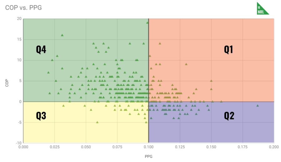
If we look at the four quadrants, we get the following characteristics:
- Q1 – PPG > .100, COP > 0, consistent and above the average performance, e.g. Jason Taumalolo
- Q2 – PPG > .100, COP < 0, inconsistent but above the average performance, e.g. Shaun Johnson
- Q3 – PPG < .100, COP < 0, inconsistent and below the average performance, e.g. Mitch Moses
- Q4 – PPG < .100, COP > 0, consistent but below the average performance, e.g. Ryley Jacks
Q3 players are rare but I would think are preferable than Q4 players. With Q3, there is a better chance that they will produce the occasional game at higher level than normal (variation goes both ways) than a Q4 player, if both players have the same PPG. Forwards tend to have an easier time of maintaining a positive COP, due to mostly racking up their production in relatively evenly distributed stats like running metres, than halves and backs.
Also note that the cut-offs of .100 and 0 are very precise and arbitrary. Plenty of value could be found in Q4 players that have a PPG of .099 (so just barely out of Q1) or Q2 players that are -0 COP with .150 PPG.
Expected Production Per Game (xPPG)
xPPG is a loose projection of what a player’s PPG could be. The idea is to account for changes to player lineups in forecasting. Substituting in a green .080 halfback for your star .180 number 7 should have a tangible impact on the expected outcome.
To do this, we blend the player’s previous performances, in the form of their weighted career PPG (wcPPG) with their PPG of that season (sPPG). For round 1, with no prior season data, we use wcPPG and then, as more games are played, include seasonal data in a weighted average with wcPPG. The more games played by that player, the heavier the weighting to the sPPG. It takes 10 games in the NRL to then rely solely on sPPG. In the Intrust Super Cup, with it’s greater flux of players, shorter careers and smaller sample size, we never fully use sPPG. We get better tipping results from using no more than a 50/50 blend of sPPG and wcPPG.
If we don’t have a wcPPG for the player, we substitute in the average wcPPG, usually around .090 for NRL and .120 for ISC. I experimented a little with reducing this below average by a standard deviation and parts thereof but it didn’t improve overall tipping accuracy, so average it is. I take this to mean that new players are equally likely to be above or below average, if they deviate at all.
Team Theoretical Production (TTP)
TTP is very simple. You multiply the xPPG of each player in the lineup by their positional average production and sum it up to get the TTP. The team in the game with the larger TTP is the tipped team.
There’s a strong correlation between a team’s total production over a season and their wins (NRL: 0.46, ISC: 0.72) and their Pythagorean wins (NRL: 0.58, ISC: 0.67). Despite this, there doesn’t seem to be much of a relationship between the score or the aggregate score and TTP but we do see a weak relationship between the difference in team’s TTP and the final margin. I haven’t yet worked out a conversion between TTP and projected winning percentage, so there’s more work to do in this area.
For now, I have assessed TTP on the 2016, 2017 and 2018 NRL seasons and the 2017 and 2018 Queensland Cup on tipping success alone. Across the five seasons, TTP has averaged a bit under 61% tipping accuracy in the regular season. Given this is over 900 games, that’s probably enough to establish that this isn’t just a fluke but it is very possible to modify just a few parameters and destroy it all. There’s probably a fair whack of favourable random noise in this but, as future iterations of xPPG do a better job of projecting future player performance, we’ll refine the system further.
Wins Above Reserve Grade (WARG)
Wins Above Replacement
Wins Above Replacement (or WAR) is a very interesting and much debated concept in baseball sabermetrics. The idea is that, out there, in the tops of the minor leagues in what’s known as AAA, exists a cohort of players that are on the bubble of being good enough to play in the majors for minimum salary. These guys are called “replacement players” and major league players are measured against this yardstick. If you can be replaced by a young AAA slugger for minimum wage who will add the same or more value to the team, why would anyone keep you around? But if you’re adding more value than the replacement player, such that the team wins more games with you than it would if you were replaced with the same AAA slugger, then WAR can quantify that value for you in wins.
WAR could be used to make the claim that, for example, the Milwaukee Brewers won 14 more games with Yelich and Cain on their roster than they would have if those guys were replaced with players on the bubble of the majors. That turns Milwaukee’s 2018 record of 95-67 (ignoring game 163) season into a 81-81, causing them to go from division winners to second last. WAR can similarly be used to make the claim that if the Brewers dropped Ryan Braun (1.1 WAR) and replaced him with the Red Sox’s Mookie Betts (10.9 WAR), they would have been a 105-57 side and making them one of the greatest teams of all time.
In theory, that’s the case at least. There is a lot of debate among nerds about the reality of it. Mostly, WAR is used to assess the value-for-money return on signings and salaries, which are public record. Nonetheless, it’s a concept that has piqued my interest and I wondered if I could apply it to a less structured game like rugby league.
Rugby league-ifying WAR
Tom Tango does a pretty good job of explaining the general mechanics of WAR very quickly but the very basic principles are this:
- Players do things that can be quantified, called stats
- These stats can be discussed in terms of equivalent points scored and points saved
- There is an equivalency between points and wins
- Therefore, there is an equivalency between stats produced and wins
This glosses over two huge issues. The first is the input statistics that are used. The second is how one figures out what a replacement level player is actually capable of.
Using the same data as for PPG (step 1), I did a slightly different regression regression. Similar to PPG, I ran the regression using buckets of data but instead of running against winning percentage, I looked at the average margin for each bucket. This gives us our stats equivalency to points (step 2) as the regression outputs, specifically the slope, gives us a rate of conversion between stats and points. Using the Relative R-squared method, these slopes are weighted in the same manner as PPG to create the production metric underlying WARG.
By comparison, the input stats for baseball are far more complicated than even I profess to understand, mostly because I don’t understand baseball well enough, even after a couple of seasons watching. The Athletic ran a piece on WAR in ice hockey earlier in the year or, rather, the half dozen different systems up for consideration, which used similarly complex means of analysing different situations to determine value. This is our first attempt at WARG, so we’re going to keep things simple.
Points = Wins
Did you know that ten runs is worth a win in baseball?
Finding an equivalency between points and wins is not particularly difficult. On average, in a NRL season, about 8,000 points are scored. There are 192 regular season games, and therefore 192 wins, distributed among the sixteen clubs. So, it takes about 40 points to win a game. Actually, that’s not quite right. For every 40 points that a team scores, they will win approximately one game. It’s not that you need to score 40 points in one game to win it (although it won’t hurt – no one in NRL history has lost after scoring 38 or more points).
There are a number of different ways to demonstrate this principle. The easiest comes from Pythagorean expectation. Start with a 12-12 team with 500 points for and 500 points against. If you increase the points difference from zero to +41, the Pythagorean expectation goes from 12-12 to 13-11. Same happens when you go to +82 and so on.
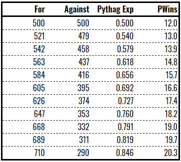
This is not a precise science and Pythag has an average error of about 5% over a season in reality (this discrepancy reduces over the longer term) but the principle is demonstrated clearly enough.
So, if you can generate enough production to be equivalent to 40 points, that production is worth approximately one win. Step 3 complete.
Stats = Points = Wins
So if we have an equivalency to translate stats (via production) into points and then points into wins, converting stats to wins should be fairly straightforward.
And it is. Rather than adjusting for time on field and positional averages, WARG is a volume measure. If you kick a ball ten metres, that’s worth a tiny fraction of a win. Score a try and that’s worth a lot more of a win. It doesn’t matter if you’re the starting halfback or a reserve grade winger, the points add up all the same.
We multiply the weightings for each stat against their volume and add that up to get an equivalent to points and then divide this by a factor of around 40 or 41, depending on the season. That gives a rough number of “wins” per player but we haven’t tackled the second huge issue, which is setting a level of a reserve grader to be compared against.
Setting reserve grade level
For baseball, the equivalent to reserve grade is replacement level. Below the major leagues, the next level down is AAA. A replacement level team is one that consists entirely of top AAA players and, by definition, it is one that would finish with a .294 winning percentage in the majors. In the modern history of MLB – since 1901 – seventeen teams have sunk under this incredibly low bar, with the most recent being the 2018 Baltimore Orioles. There have been 2466 seasons played in that time, so replacement level represents about 0.6% of all teams played.
In rugby league’s modern era, since 1988, 484 first grade seasons have been played, if we exclude 1997. Applying that 0.6% would mean replacement level is reflected in the three or four worst teams of that era. Here are the records of the worst teams:
- 1993 Seagulls: 1 win in 22 games (.045)
- 2016 Knights: 1 win, 1 draw in 24 game (.063)
- 1990 Rabbitohs: 2 wins in 22 games (.091)
- 1995 Cowboys: 2 wins in 22 games (.091)
- 1989 Steelers: 2 wins, 1 draw in 22 games (.114)
- 1991 Seagulls: 2 wins, 1 draw in 22 games (.114)
- 1999 Magpies: 3 wins in 24 games (.125)
- 2003 and 2006 Rabbitohs: 3 wins in 24 games (.125)
I’m going to gloss over the fact that the season is now longer and set the replacement level at 2 wins in a year. That is, a team of top reserve grade players could win two games, on average, in a NRL season.
If that sounds scandalously high, think less about what you naturally think of when you think “reserve grade” (i.e. terrible) and focus on guys like Jai Arrow and Jamayne Isaako, who played in Queensland Cup in 2017 and pulled on rep jerseys in 2018, or if you prefer more southerly and current examples, Jarome Luai and Lachlan Lewis, who spent most of 2018 in reserve grade and appear to be poised for breakout seasons in first grade.
Applying the same logic to the Queensland Cup is a bit more depressing. The QCup has run from 1996 to now and features a number of seasons with no wins, including:
- 1996 Jets: 0 wins in 15 games
- 1998 Grizzlies: 0 wins in 22 games
- 2002 Scorpions: 0 wins in 22 games
- 2003 Panthers: 0 wins in 22 games
- 2004 Brothers-Valleys: 0 wins, 1 draw in 22 games (.022)
- 1997 Scorpions: 0 wins, 1 draw in 18 games (.028)
Four of those teams conceded over 1000 points in their season. The ’98 Grizzlies, ’03 Panthers and ’04 Brothers-Valleys never came back. The ’02 Scorpions merged with the Magpies for the 2003 season.
For the QCup, I’m setting replacement level at one draw, no wins. That is a team of BRL quality amateurs might be able to snag a draw against the semi-professionals and professionals that make up the Queensland Cup. The actual level may be a little higher in the more recent, slightly more professional form of the competition it takes today but even since 2010, we’ve had two teams finish with just one win (2014 Falcons & 2015 Capras).
Reserve grade production
Taking these down to player level is not a straightforward exercise and it requires another regression.
If we run a regression between wins and tries scored and another between wins and tries conceded, you can estimate how many tries a team will score and concede based on a given number of wins. For the reserve graders in the NRL, this turned out to be 54 and 120, respectively, for two wins. In the Intrust Super Cup, despite the lower level set, it’s 54 and 139 to get one half of a win.
You can then run the regression between tries scored/conceded against any number of season total stats. I didn’t bother with bucketization this time because, instead of working with the statistics from 1,000 NRL matches, I’m using the end of regular season stats for 2013 through 2018 and there’s not enough different values to put in buckets.
The purpose of this is to project what kind of end of season stats our reserve graders in the NRL might generate. Even if you sent out a bunch of randoms off the street and put them on the field at Suncorp, they would still be able to generate some metres and kick the ball a distance, so what would a group of talented reserve graders actually be capable of?
If we feed in 54 tries scored and 120 (or 139) tries conceded into the trends that came out of the regressions and then taking a weighted average between the two results, we get this table:

I’ve selected stats based on their correlation from the first regression with buckets of average margin (there’s a high correlation between win percentage and points difference, so it should be no surprise to see the same stats appearing as in PPG) and have a clear gap between the league average and the reserve grade projection. I discarded handling errors, for example, because the league average was actually less than the reserve grade projection, implying that more handling errors make you more of a professional.
If we make the assumption that reserve grade teams break up their workload in the same way as the league average, then it becomes possible to start calculating what a reserve grader looks like at a given position. Indeed, the simplest way to do this was to take the positional averages calculated during PPG and apply the percentage gap between the reserve grade side and the league average. Typically, this about a 20% discount for metre-based stats and 40-50% discount for Poisson-distributed stats, like line breaks and assists.
This gives us a baseline level of production that a reserve grade player will produce. Therefore, any production a player creates over that is production over reserve grade. As explained earlier, production can be converted to points and then on to wins to give us Wins Above Reserve Grade.
So what?
Unless I can unearth some hitherto unseen connection, we’re not going to use WARG for tipping or forecasting, so what’s its purpose?
Well, mostly it’s a first step on a longer road to an improved system of assessing players. I don’t see PPG altering much in the future but the fundamentals of WARG could be wiped clean in the next iteration for something better.
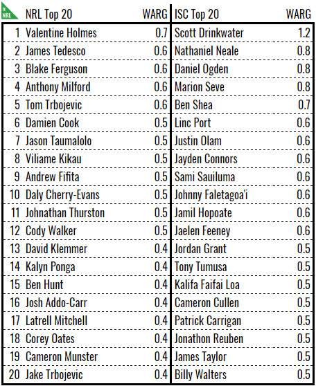
In the meantime, if you’ll cast your head to the side of the screen (or scroll to the bottom if you’re on mobile), you’ll see a list of 2018 Honours, including a MVP, MPP and the best players in their roles. With the exception of MPP, these player honours are given based on WARG. Indeed, using WARG generates a pretty handy top twenty player list for 2018.
To be honest, I expected a season’s WARG to be in the range of about -1 to +2 but we didn’t quite get there on the current version. I think it’s likely that WARG is underestimating the number of wins. Given that there are 192 games to win, of which the reserve grade side is winning two, there should be 190 or so WARG to go around. Most seasons average about 40. I decided against artificially scaling the numbers up and would prefer to revise the underlying mechanics to address this in future version.
That said, a team’s total season WARG correlates pretty well with actual wins (NRL: 0.52, ISC: 0.75) and Pythagorean wins (NRL: 0.67, ISC: 0.70). If the NRL R-squared to wins looks a little sad, it’s because we just came off a season where the top eight teams finished with one win of each other. Take out 2018 and the dodgy 2013 data and we’re at 0.68.
As a point of comparison, the top MLB players can generate around 6 to 8 WAR for a single season, if we put aside truly freakish performances like Mookie Betts and Lonnie Smith. Given that the MLB schedule has 6.75 more games than the NRL season, that means our top players are scaling up to around the 4.5 to 6.5 WAR mark, which is, if nothing else, the right ballpark.
If only we knew their salaries, we could really judge their value.
Telling the whole story
I recently had the charge levelled at me that stats don’t tell the whole story. Yes, I, a person who has written over 150,000 words, not including this 7,000 word tome, of rugby league analysis, supposedly hadn’t considered this breathtaking insight into what I was doing. To that end, here’s some discussion about where stats fall short that I can cite in future to show that I’m not actually that short-sighted.
Some general context
The most egregious example of a disparity between perception and the numbers that I found was the wins above reserve grade for David Nofoaluma and Adam Blair. Nofoaluma, a winger for the Wests Tigers who spent a chunk of last season in reserve grade, has a career +1.3 WARG (cWARG). Blair, a Kiwi Test international and stalwart contributor to a number of good packs, has a cWARG of -0.4. Looking at those numbers in isolation, Blair should’ve been the one packed off to reserve grade, possibly never to return and much earlier in his career than now.
This highlights some of the issues inherent in the system. All stats-based system absolutely value attacking contributions over defensive ones. I have no doubt in my mind that if Adam Blair was really as bad as -0.4 cWARG, then he would not have played for as long as he has. No one said PPG/WARG was perfect and it’s entirely possible that his below average offensive efforts are more than offset but what he puts in in defensive situations. Or maybe he has incriminating footage of someone.
“Is David Nofoaluma a bad defender?” is a question I don’t have an answer to because I don’t watch him specifically close enough but his appearances for the Magpies last season suggest that someone with a closer eye on him probably thinks so. If someone scores a try on his wing, is it his fault? To some extent, obviously, yes, but also we’ve all been put in situations by our colleagues that are irretrievable. In those cases, the defensive failure occurs further down the line, the effect rippling out to the wing. Nofoaluma looks bad but if the bad read is made by the edge forward and Nofoaluma is left with the overlap to deal with, then how much blame should he really be apportioned?
So, if we’re making a list, one thing we lack is a decent measure of defensive contributions. Attacking contributions are easy to measure because they often result in something happening that can be counted: a metre is gained, a try is scored, the line is broken. Defensive contributions are difficult to measure because a good contribution often results in something not happening: an attacker opting to pass instead of charging the gap in the line, a ball not put down because of the defenders’ efforts.
As Paolo Maldini said, “If I have to make a tackle then I have already made a mistake.” Indeed, tackles made in rugby league has a negative correlation with winning. The more tackles you make, the less likely you are to win the game but, paradoxically, a team who makes zero tackles probably won’t be winning much either. Resolving this and the other issues highlighted would go a long way to improving both systems.
Another thing we lack is a measure of effectiveness. Tackle breaks (or their counterpart, the missed tackle) are an excellent example. They correlate with wins but the reality is that a tackle break is often met with a second tackle. Little to no advancement of the ball is made but in rare cases, a break leads to a line break. Not all tackle breaks are equal but they are treated as such.
What we also lack is a measure of meaningfulness. Kick return metres correlate excellently with winning and points and whatever other positive measure you care to employ. It’s hard to imagine, however, how advancing a ball an extra metre per kick return is that important. What seems likely to me is that good fullbacks win footy games and good fullbacks also have a lot of kick return metres. The stat itself is incidental, maybe even meaningless, except as an easy-to-count marker of overall backline talent.
Some context for PPG
PPG is prone to two particular effects that need consideration.
- The Austin effect is neatly demonstrated by this tweet from Fox Sports Lab. It is where performances, based on a small sample size, are extrapolated in a meaningless way.
- The Tamou effect is illustrated by this post from The Obstruction Rule. It is where the relative nature of player performances, both in volume and share of workload, are not put into a meaningful context.
The Austin effect has a couple of fallacies underpinning it. One, the effect comes from having too small a sample size on which to judge. Maybe the other hundred times that Austin plays for just fourteen minutes, he doesn’t score a try, giving him an average try scoring rate of 0.05 tries per 80 minutes.
Two, the Austin effect comes from linearly extrapolating a 14 minute stint out to 80 minutes without correcting for the fact that Blake Austin will never score six tries in one game in the NRL unless something has seriously gone wrong it is not possible to maintain that work rate in a professional game of rugby league. The reason prop forwards play limited minutes is that the team gets the optimal bang (metres gained) for its buck (number of substitutions) when props play fifty or sixty minutes. If they play more than that, the prop will gain more metres in total but a fresher prop, even one of a lower quality but coming off the bench, would’ve generated more in that time span.
This is an issue for PPG, even though we do not use linear extrapolation of time on the field. Earlier versions did and Jack Joass, one time fullback for the Mackay Cutters, managed to register 3 minutes of playing time in round one of 2018, scored a try and had a 32x multiplier applied. He was on track to be MPP for 2018 based off that and four other decent performances later in the season. This was when I decided to switch to a logarithmic solution to mitigate this effect.
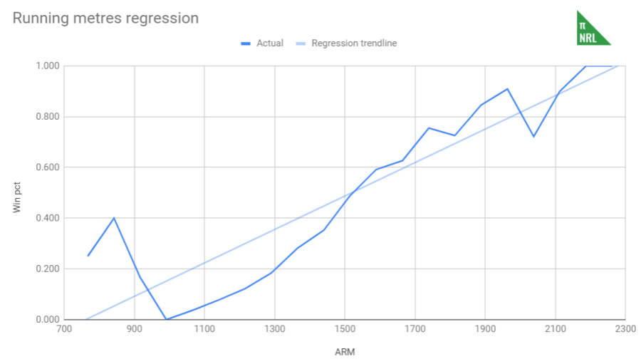
The first part of the Tamou effect is born out of the fact that there is a diminishing return on investment for some statistics. For example, how many metres do you really need to make to win the game? I would argue “As many as you need to and no further” but to crystallise this point, consider how much more likely a team who makes 2200m is to win a game than a team who makes 1800m or 1400m. A team that runs 1400m is about 50% chance of winning. At 1800m, that rises to about 95% but a team who runs 2200m has an approximately 100% chance of winning the game. So going from 1400m to 1800m, a net increase of 400m or an extra 28%, increases your win percentage by almost double, but going from 1800m to 2200m, again an increase of 400m or an extra 22%, increases your win percentage by only 5%.
The second part of the Tamou effect is the way the workload to generate statistics broken up among teammates. Aaron Woods, a marshmallow that somehow gets a Kangaroos jersey on the regular, has comparatively amazing looking stats compared to Reagan Campbell-Gillard. The main reason for that is that Woods was one of two semi-competent forwards in the Bulldogs pack at the time the post was written. Campbell-Gillard, again at the time, was playing in a monster of a pack. As a percentage of work that is required to be done, less responsibility falls on the shoulders of Campbell-Gillard if he has colleagues like James Tamou, Bill Kikau, Isaah Yeo and company to share the workload with. If Aaron Woods only has David Klemmer and no one else worth a damn, then he has to do a lot more and correspondingly, pads his stats. This brings us back to the earlier comments about the meaningfulness of statistics.
For the record, this absolutely affects not only PPG but probably all rating systems built like it for games of medium structure like rugby league. It’s less of an issue in baseball, where the greater level of structure and minimal interplay between teammates means that this effect is not as prevalent. However, for rugby league, modestly above average players will look very good if their teammates are garbage than genuinely good players will look if they play in a squad burdened with talent.
Some context for WARG
WARG will probably have to develop several times over before it becomes something reliable. That means last year’s MVP might not hold the same title next year. The Baseball Reference version of WAR is currently v2.2. This is v0.1 of Pythago NRL WARG but even as this demonstrates, the basics get you a long way to the end point.
But unlike in baseball, rugby league is not a plug and play sport. You can’t necessarily take a -0.1 WARG player, replace him with a +0.9 and expect an extra win over the next season. While that’s what the system implies, it’s not what actually happens.
We saw this amply demonstrated in 2018, when the star-studded Cowboys failed to fire with two world class halves in Michael Morgan and Johnathan Thurston. There were a number of factors at play (Thurston’s age, ineffective outside backs, poor strategy) but it’s clear that putting Morgan, +0.7 sWARG in 2017, and Thurston, +0.7 sWARG 2016, didn’t equate to any additional wins for the Cowboys, especially when the team finished with a grand total of eight. In the end, the halves generated a total of +0.6 WARG between them (yes, I know Morgan was injured for most of the season but made worse by his replacement, Te Maire Martin putting up -0.2).
Which brings us to what economists might call stickiness. The theory underpinning WAR assumes that replacement players are available and there is a much larger quantity of replacement players available than slots in the majors. The reality is that that’s not the case. Major league teams have farm systems, like feeder clubs in rugby league, that they draw their players from. Much like there’s only a handful of top players at the peak of the sport, there’s only a handful of top players in the next level down. That means your search for a replacement player is actually limited to those available to you through your farm system or available via trades, which obviously have a cost. Of those that are available, only a small selection will be genuine replacement players at 0 WAR because there’s only a small percentage of guys at the top of any pyramid. The rest will perform at a lower level than that. It gets more complex when one consider positional constraints. You can’t replace a 0 WAR pitcher with a 0 WAR batter and vice versa.
If you put yourself in your coach’s shoes, at what point do you cut a player? Is it the second he dips below reserve grade level (into minus WARG) to be replaced with the next top guy down or would you have to see periods of sustained underperformance before you drop him? It’s an interesting question but it’s obviously not the former. Dropping a player has a cost and even if you don’t trade for the replacement, that cost is paid for in team cohesion and morale. Over a season, would you drop a marginal player to recover one or two tenths of a win? That’s in the best case scenario. In reality, you might not have a replacement level player available to replace your marginal hooker. You might do it to recover half a win though.
